Web View
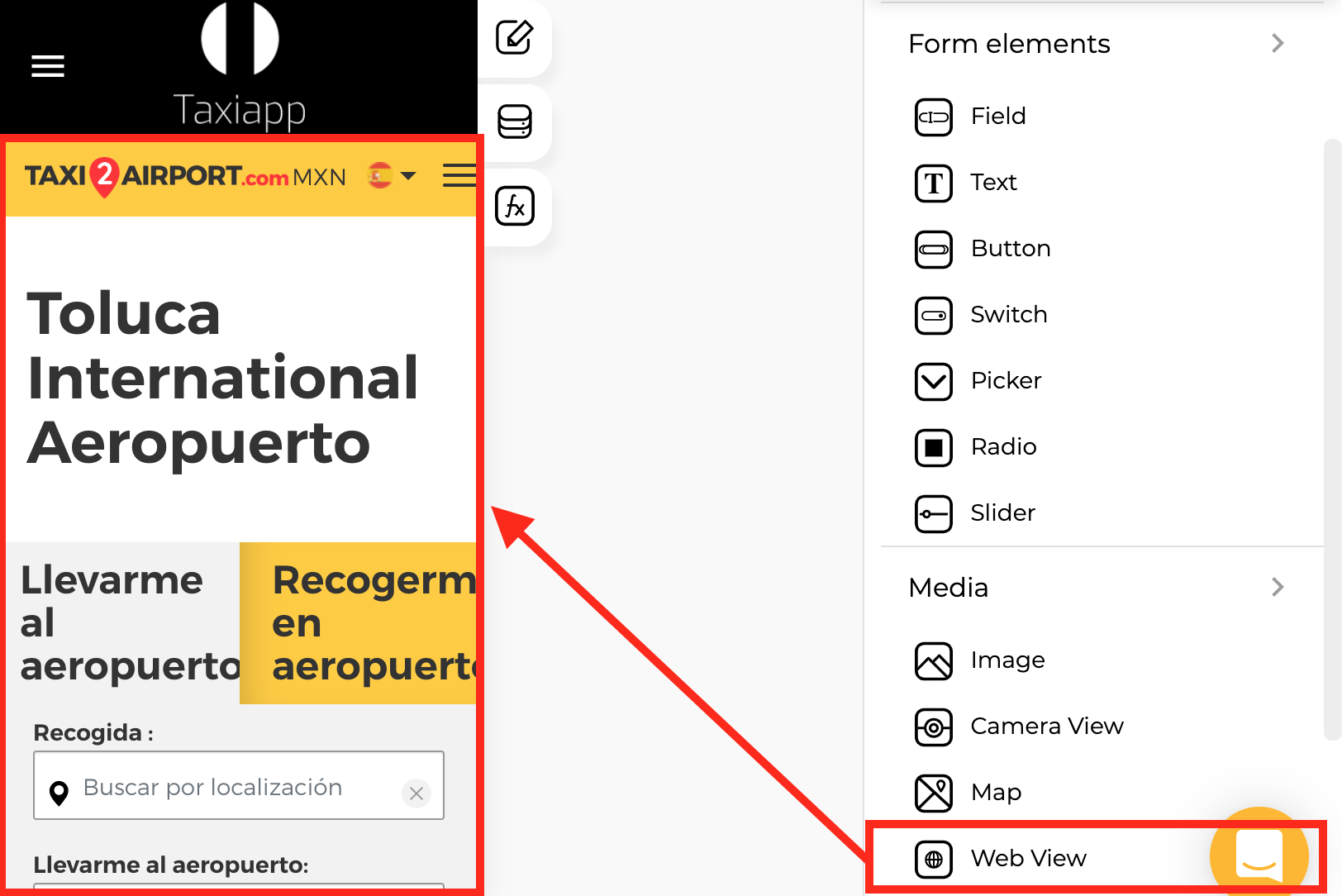
🎨 Styles
- Appearance
- Background color: select the background color using the color picker.
- Background image: this property set one background image for web view element.
- Margins
- Padding: you can specify how much space you want between the border and contents of the web view element.
⚙ Properties
- Generic properties
- Enable skeleton loaders: this tool provides an indication to the user that something is coming but not yet available on the web view element.
- Control is hidden: hide the web view element from the screen
Info
The skeleton loader component provides a user with a visual indicator that content is coming/loading. This is better received than traditional full-screen loaders.
- Specific properties
- URL for web view: The URL is the address of a website. You can find it in the address bar on the top of your top web browser. Alternatively, you can find the URL for a link by right-clicking it and copying the link.
Warning
The web view element only allows certificate Url with https:// Example: https://apphive.io/
👆 Events
- On load: called ****when screen load completes successfully.