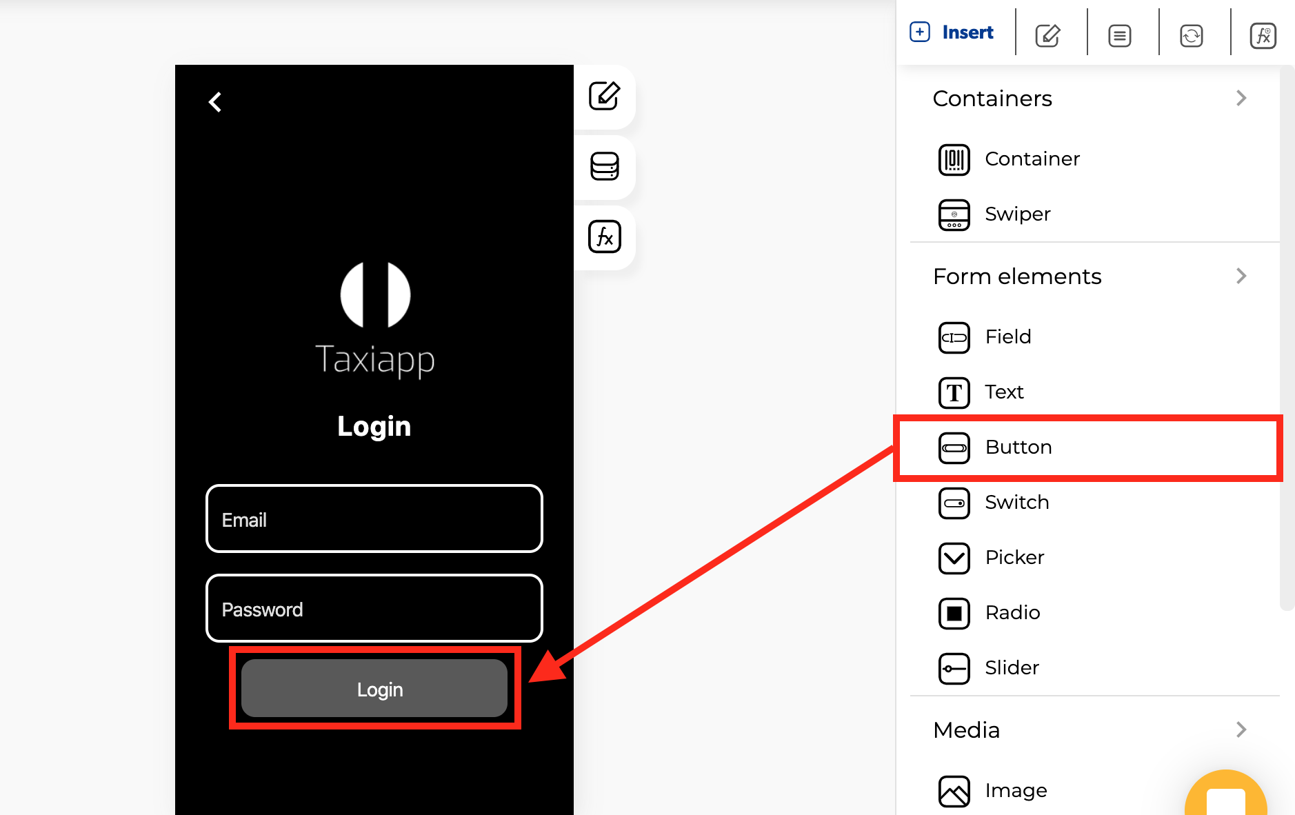
Button
🎨 Styles
-
Appearance
-
Background color: select the background color using the color picker.
-
Text color: select text color in the button element using the color picker.
-
Typography
- Font size: size of the text that appears on the button element.
-
Style
- Normal: default text display.
- Italic: display the text in italics.
- Underlined: display the text underlined.
- Dimensions
-
Width: set how wide the button element is using.
-
Height: set how tall the button element is using.
-
Margins
- Margin: you can specify how much space you want between the edges of the button element with the screen or another elements.
- Borders
- Border width: enter how wide you want the border outline of the button element to be.
- Border radius: enter how round you want the edges of the border for the button element to be.
- Border color: pick a color for the border of the button element.
- Border style: select if you want the border of the button element to be a dotted, dashed or solid line.
⚙ Properties
- Generic properties
- Control name: you can add a name to the button element this could be the way to identify this element about another elements.
- Enable skeleton loaders: this tool provides an indication to the user that something is coming but not yet available on the button element.
- Control is hidden: hide the button element from the screen.
Info
The skeleton loader component provides a user with a visual indicator that content is coming/loading. This is better received than traditional full-screen loaders.
- Specific Properties
- Control Label: text to display inside the button
- Button icon: a custom icon for the button
- Direction: specifies the directional flow of the button and the icon.
👆 Events
- On press: the on press event provide the capability to capture tapping gestures and display feedback when this gesture is recognized.