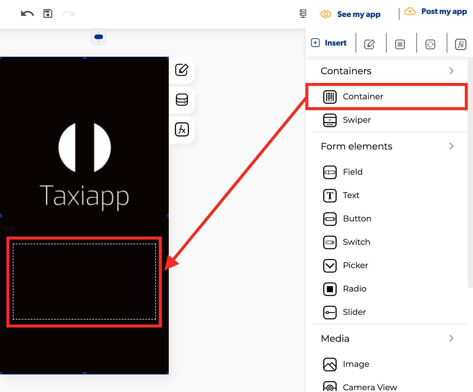
Container
🎨 Styles 
- Typography
-
Font size: size of the text that appears on the container element.
Appearance * * Background color: select the background color using the color picker. * Background image: this property set one background image for container element. * Dimensions
-
Width: set how wide the container element is using.
- Height: set how tall the container element is using.
- Height auto: aligns the dimensions of the containers element content automatically to the container element.
****
- Layout
- Direction: specifies the directional flow of the elements inside the container element.
- Scroll: activate a vertical or horizontal bar commonly located on the far right or bottom of a screen that allows you to move the screen viewing area up, down, left, or right.
- Control z-index: controls which components display on top of others.Think of the z-direction like it's pointing from the phone into your eyeball. Property sets the z-order of a positioned element and its descendants or flex items. Overlapping elements with a larger z-index cover those with a smaller one. ****
- Margins
- Padding: you can specify how much space you want between the border and contents of the container element.
- Margin: you can specify how much space you want between the edges of the container element with the screen or another elements.
- Shadows
- Presets: Add a shadow around the container
Info
To set a shadows in a container you need to activate background color or background image.
- Borders
- Border width: enter how wide you want the border outline of the container element to be.
- Border radius: enter how round you want the edges of the border for the container element to be.
- Border color: pick a color for the border of the container element.
- Border style: select if you want the border of the container element to be a dotted, dashed or solid line.
⚙ Properties
- Generic properties
- Control name: you can add a name to the container element this could be the way to identify this element about another elements.
- Enable skeleton loaders: this tool provides an indication to the user that something is coming but not yet available on the container element.
- Control is hidden: hide the container element from the screen.
- Specific Properties
- Split percentage: Numerical division format example: 25,25,25,25 for a 4 divisions container.
- Lock container: any object inside of the container element cannot be modified and cannot add more elements to the container.
👆 Events 
- On press: the on press event provide the capability to capture tapping gestures and display feedback when this gesture is recognized.
- On reach end: called when all rows have been rendered and the list has been scrolled until the end of the element content.
- On refresh: called when the user has dragged the refresh indicator far enough to demonstrate that they want the app to refresh.
📝 Writable Properties
- Background image
- Style height value
- Is hidden
- Style align item
- Style background
- Style border color